Print Templates
During UTMB Health’s transition from one campaign to the next, there sprung a need for updated print collateral that matched the newer campaign visual identity. To fill the need for quality control and greater brand recognition between print pieces and advertisements, I developed templates for a variety of print handouts. While collaborating with other designers and marketers, I discovered ways to maintain consistency, not only in visual appearance and imagery, but in the tone and wording of verbiage used within these templates. As a result, the final templates reduce the production time of pieces that need creation in the future, for me, as well as other designers.
-
For this project, I needed to develop and update templates for service line rack cards and educational bifolds within the brand guidelines of UTMB Health’s ‘Caring For’ campaign. While creating these templates, I had to keep in mind how the typography, layout, and imagery could be implemented into future pieces.
-
Educational Bifolds
Service Line Rack Cards and Backers
Patient Referral Cards
-
My goals for this project were to design a template system for print collateral in compliance with new UTMB Health branding standards, simplify the process of creating collateral with fixed templating, increase brand recognition through consistency, and develop an illustration style that can repeatedly be produced.


Educational Bifolds
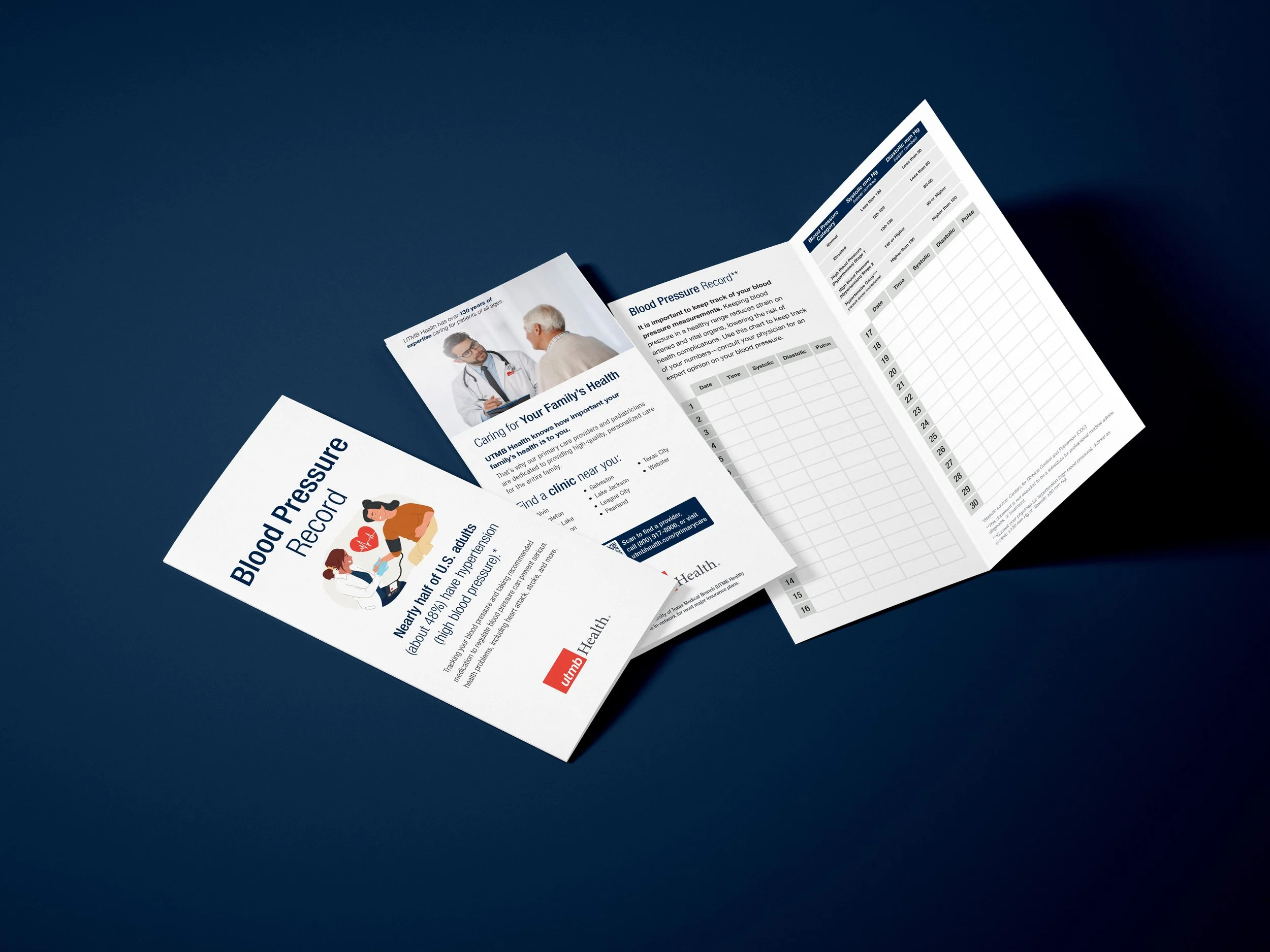
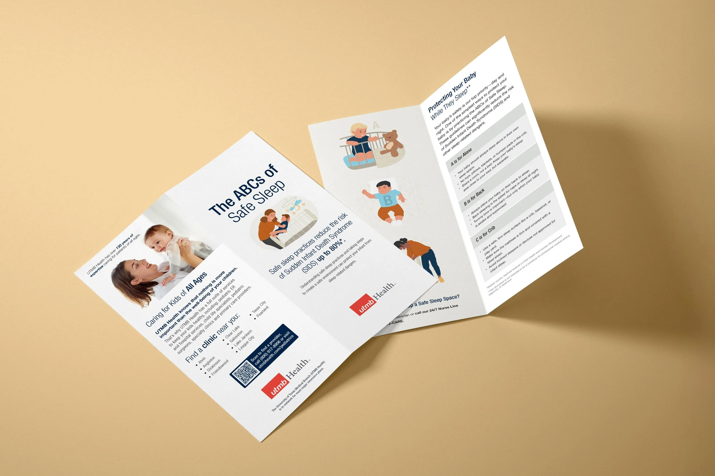
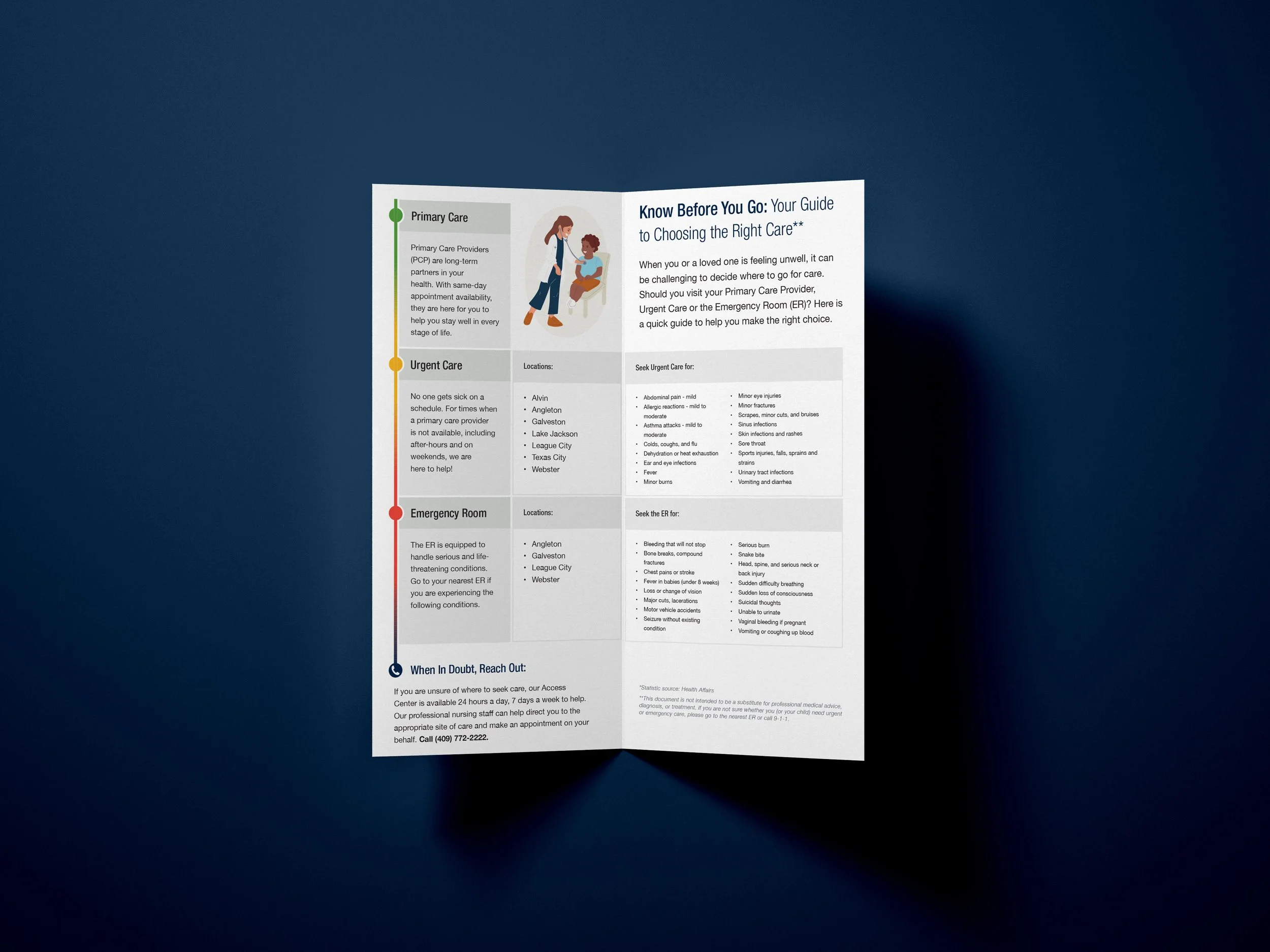
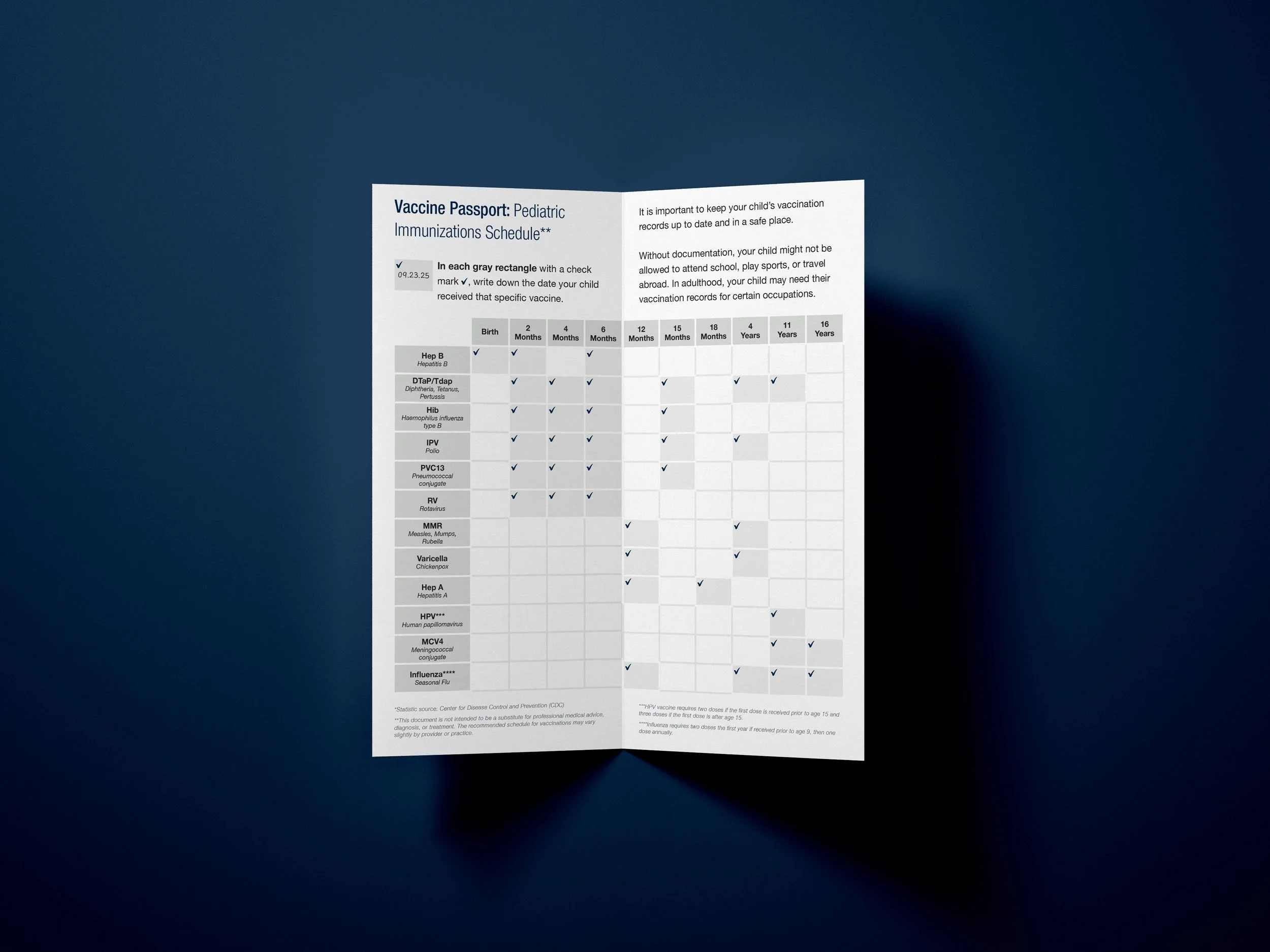
The educational bifolds take a specific topic from a range of service lines and provide the viewer with information on how to implement better health practices into their day-to-day. While creating the templates for these bifolds, I kept in mind that the content should be easily digestible and approachable. Through imagery, illustration, and verbiage, I worked to create a practical piece that informs UTMB Health patients’ while boosting our brand image.

Before and After
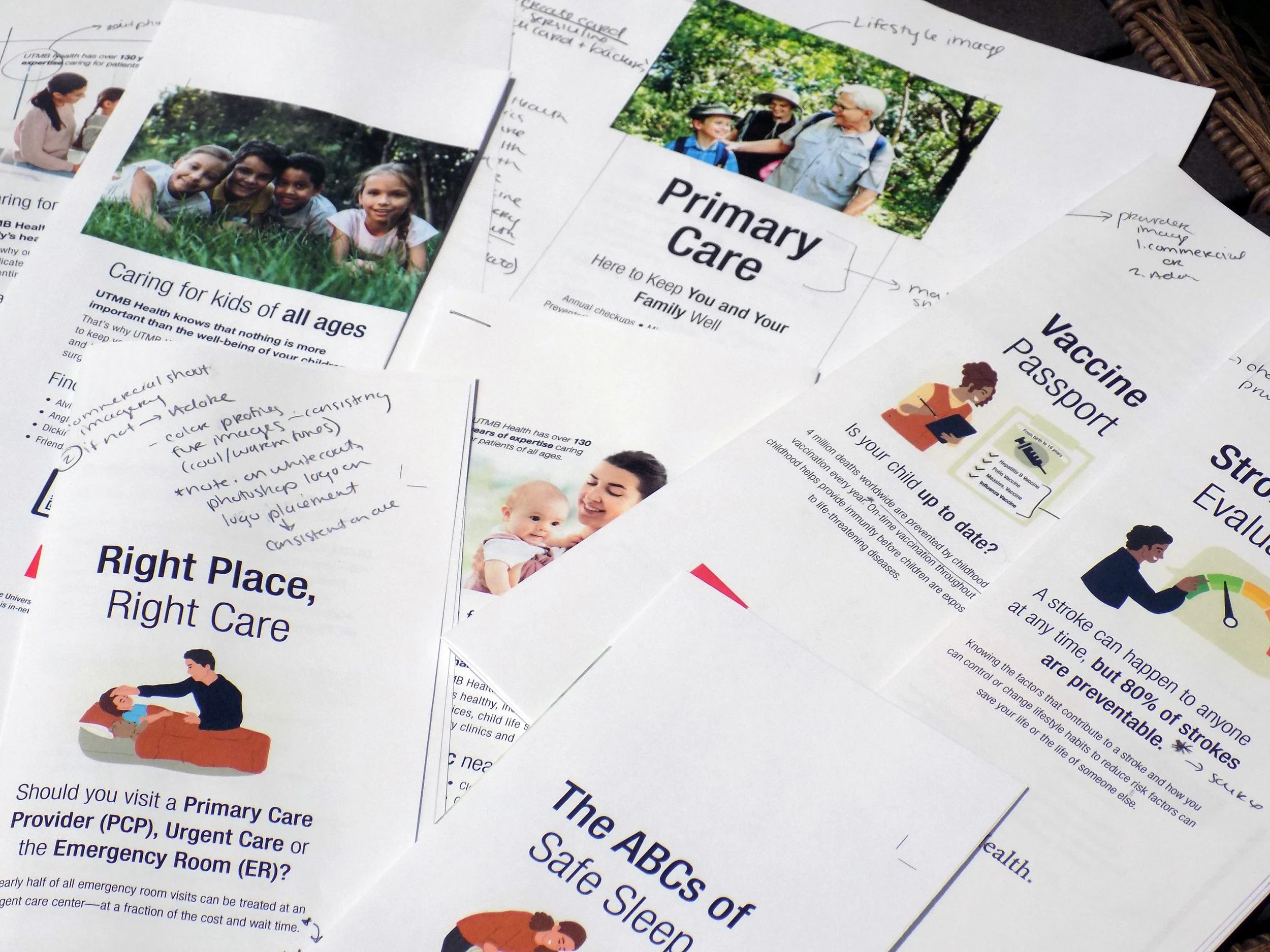
With print collateral from the former campaign, there was some visual consistency in basic branding components like color and typeface choices. However, there was not a consistent layout, illustration style, infographic formatting, nor a type specimen.
Following my redesign of the educational bifolds and rack cards, print pieces were now unified across smaller details—making them a cohesive set rather than standalone pieces.
I worked alongside other designers and marketers to review the templates, make note of inconsistencies, and iterate on the pieces. This review process ensured that our handouts fulfilled UTMB Health’s goals with our print pieces: provide beneficial educational information while boosting our image and direct the viewer to take action to either book and appointment or visit our website.
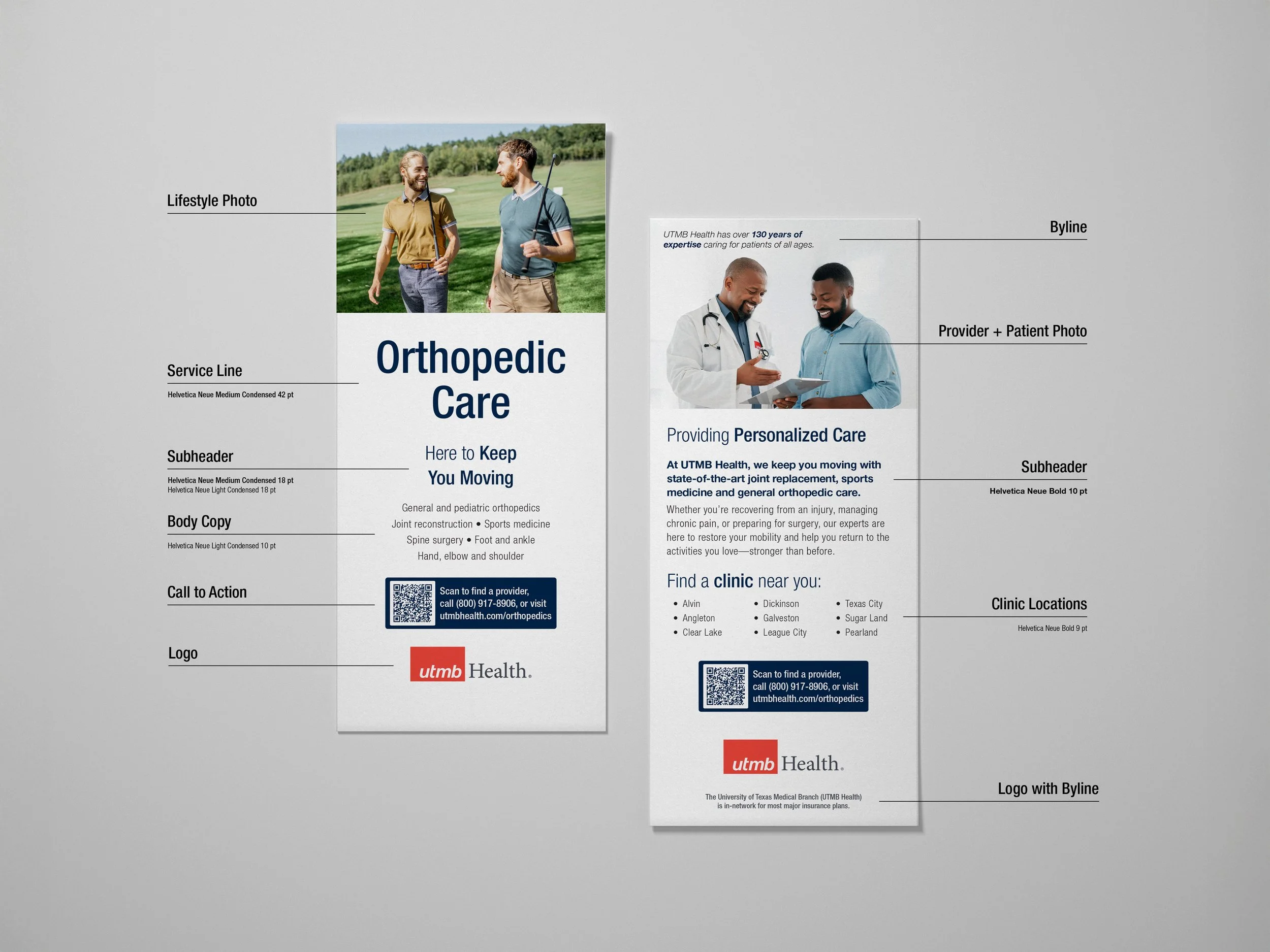
Templating
The tight restrictions of the template for the educational bifolds not only helped me as a designer with visual consistency, but assisted the marketers with verbiage and tone. Once the first template was finalized, writers were able to base content for new templates on the structure of the original. Word and character counts for headers were now limited, call-to-actions were repeated throughout pieces, and body paragraphs became concise.
The collaborative effort to write content for these templates enabled me to adjust content on my own and practice my writing skills. I learned to approach writing from the perspective of a designer and a marketer.

Blank Template
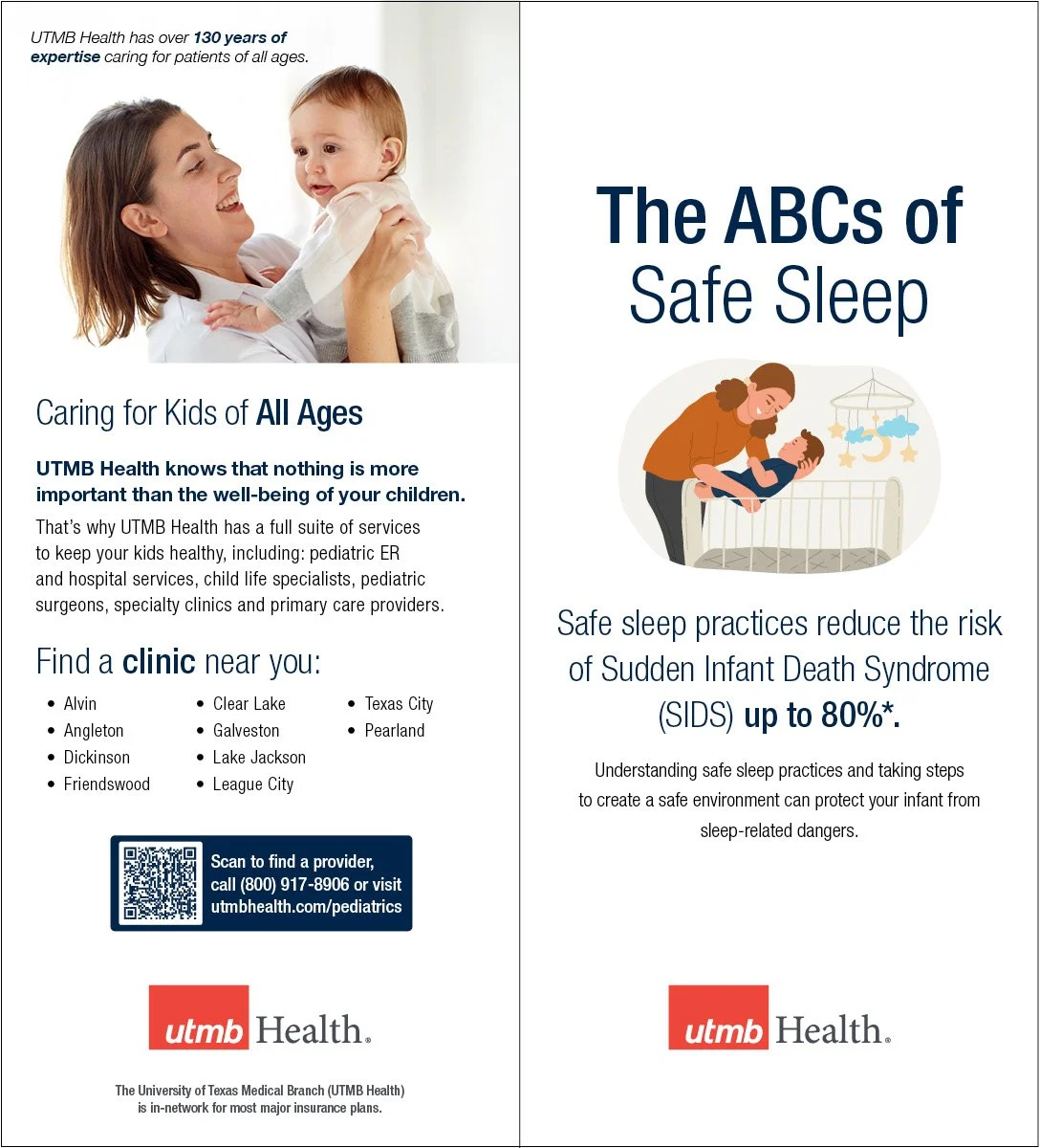
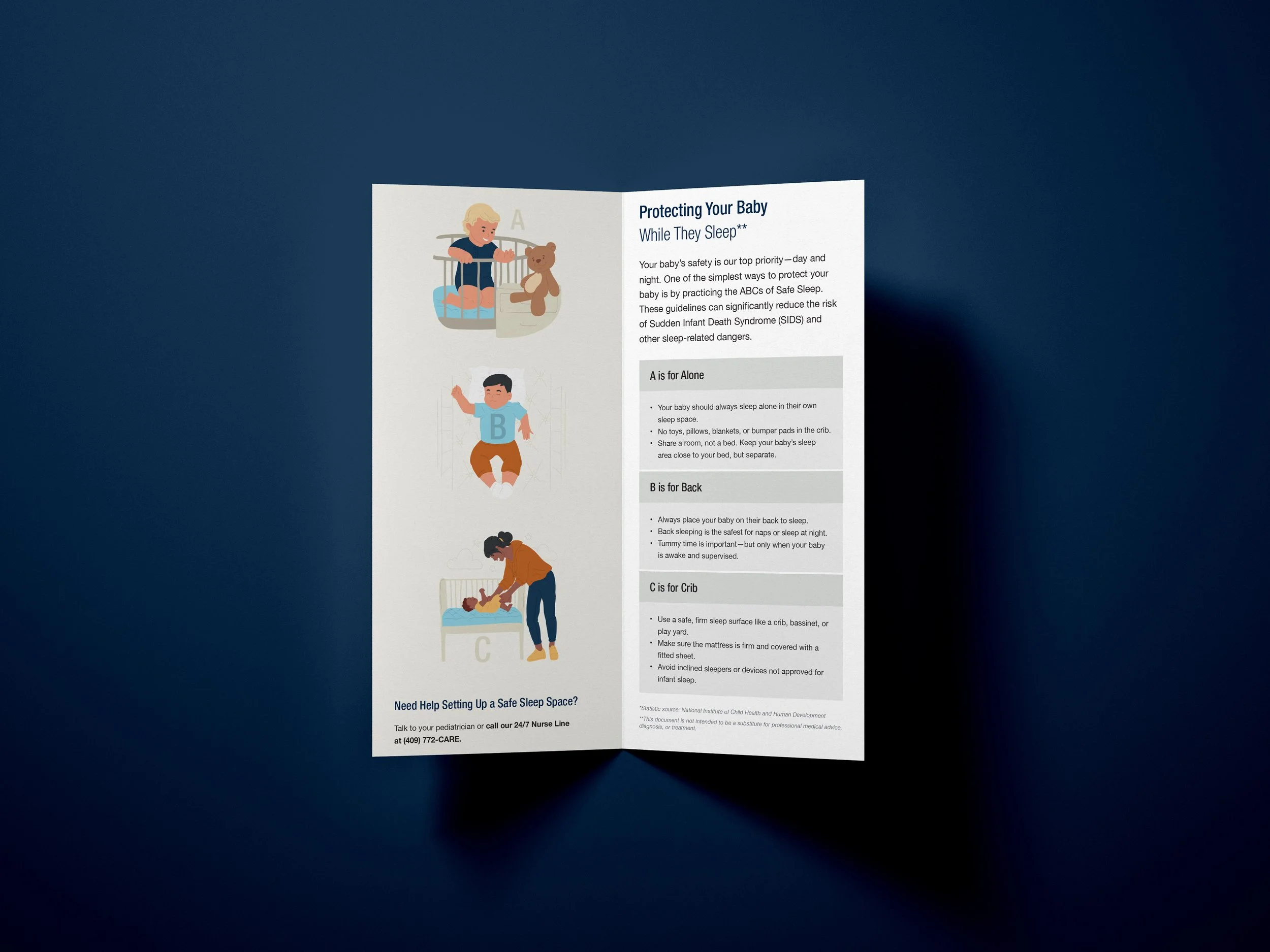
Completed Template - The ABCs of Safe Sleep
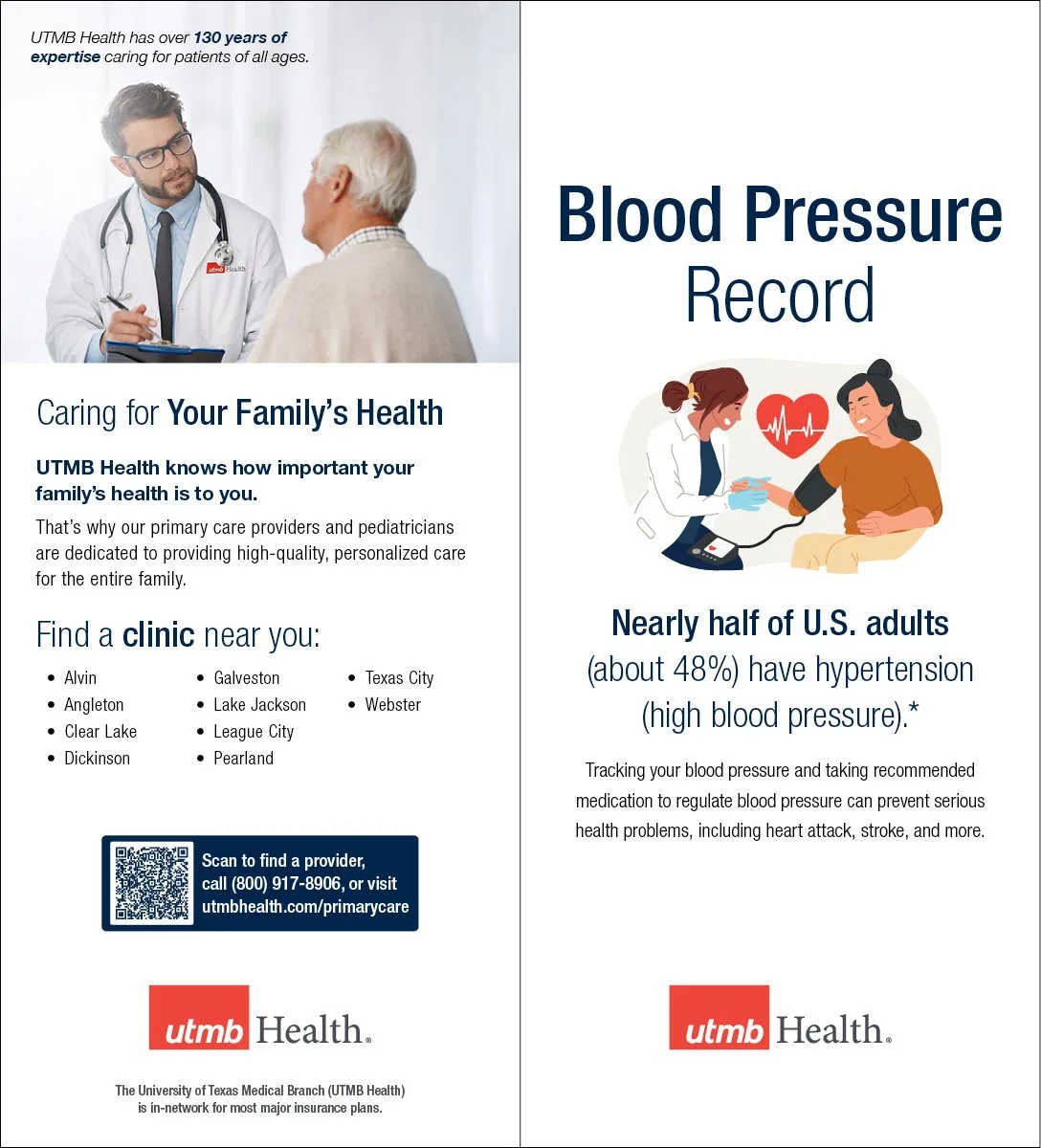
Completed Template - Blood Pressure Record
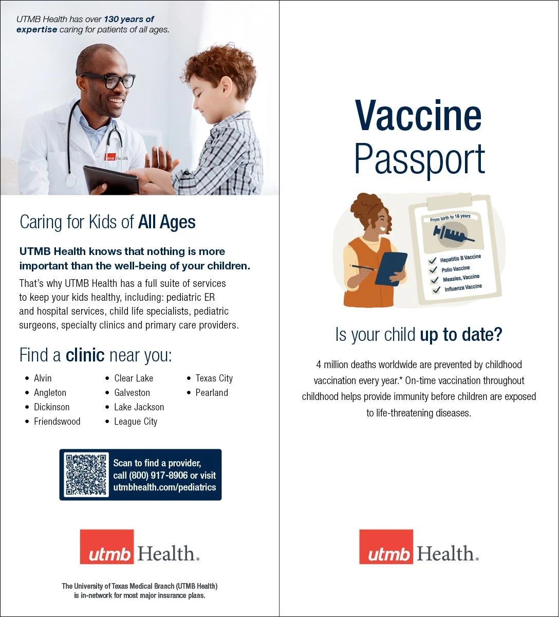
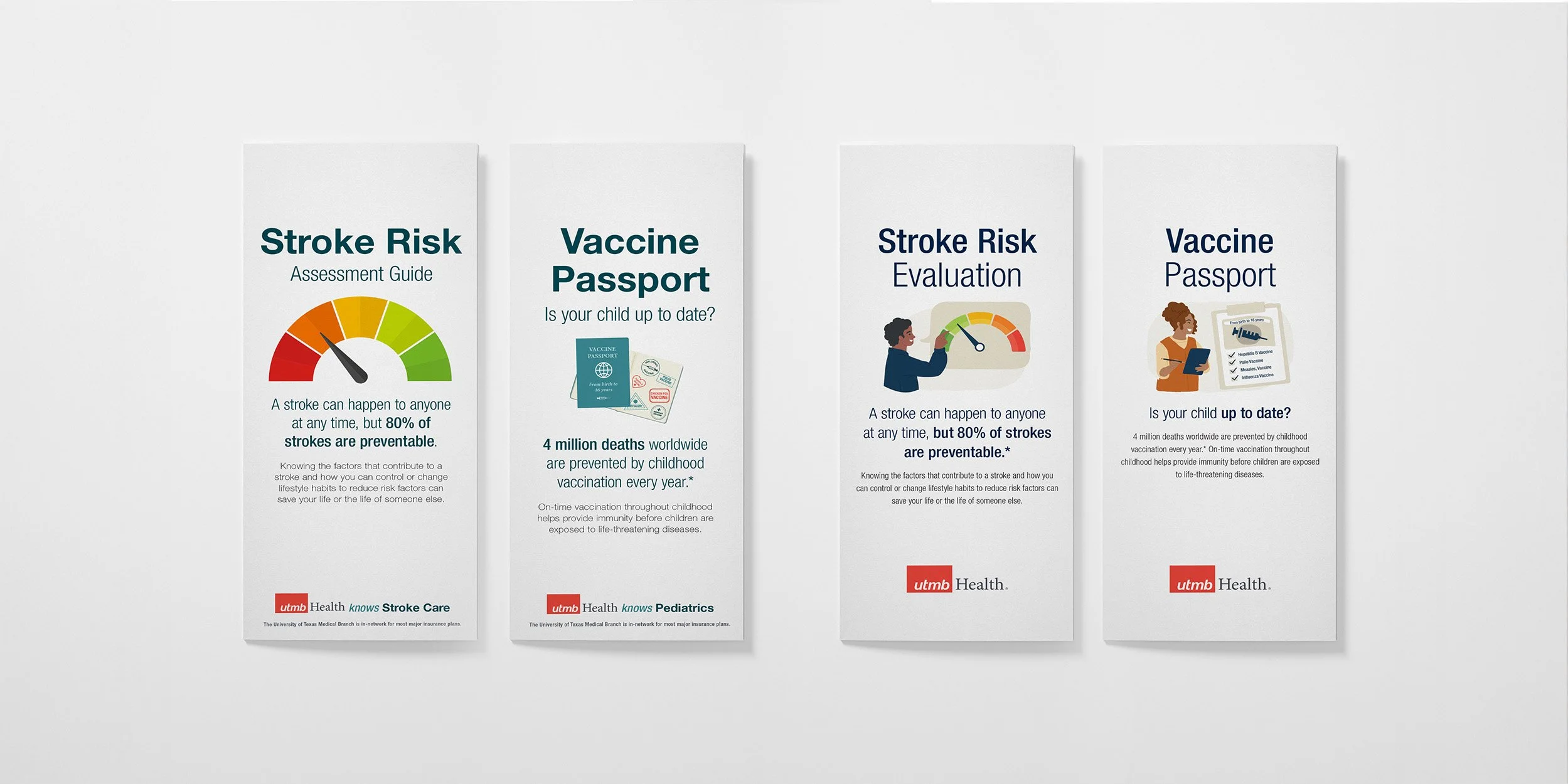
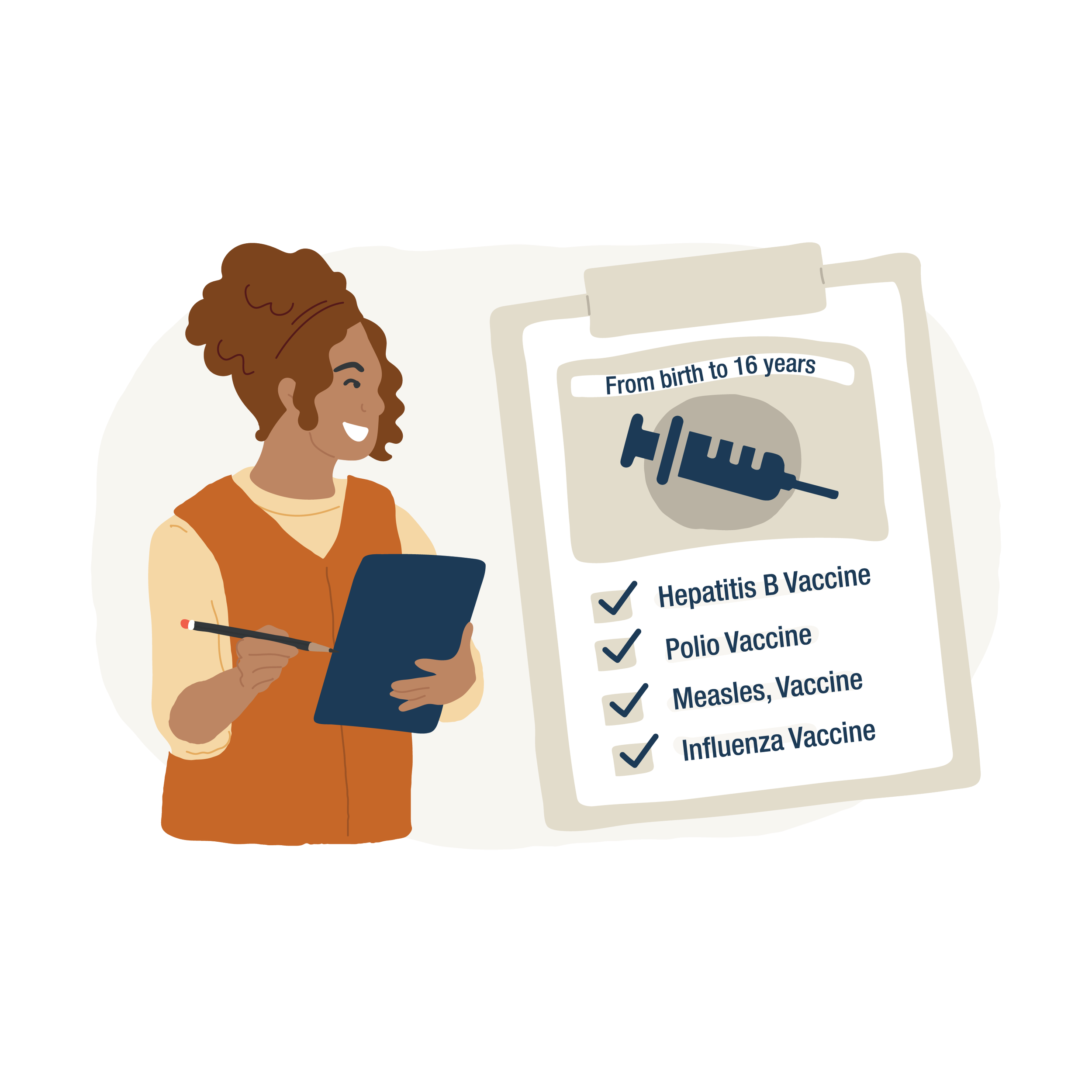
Completed Template - Vaccine Passport
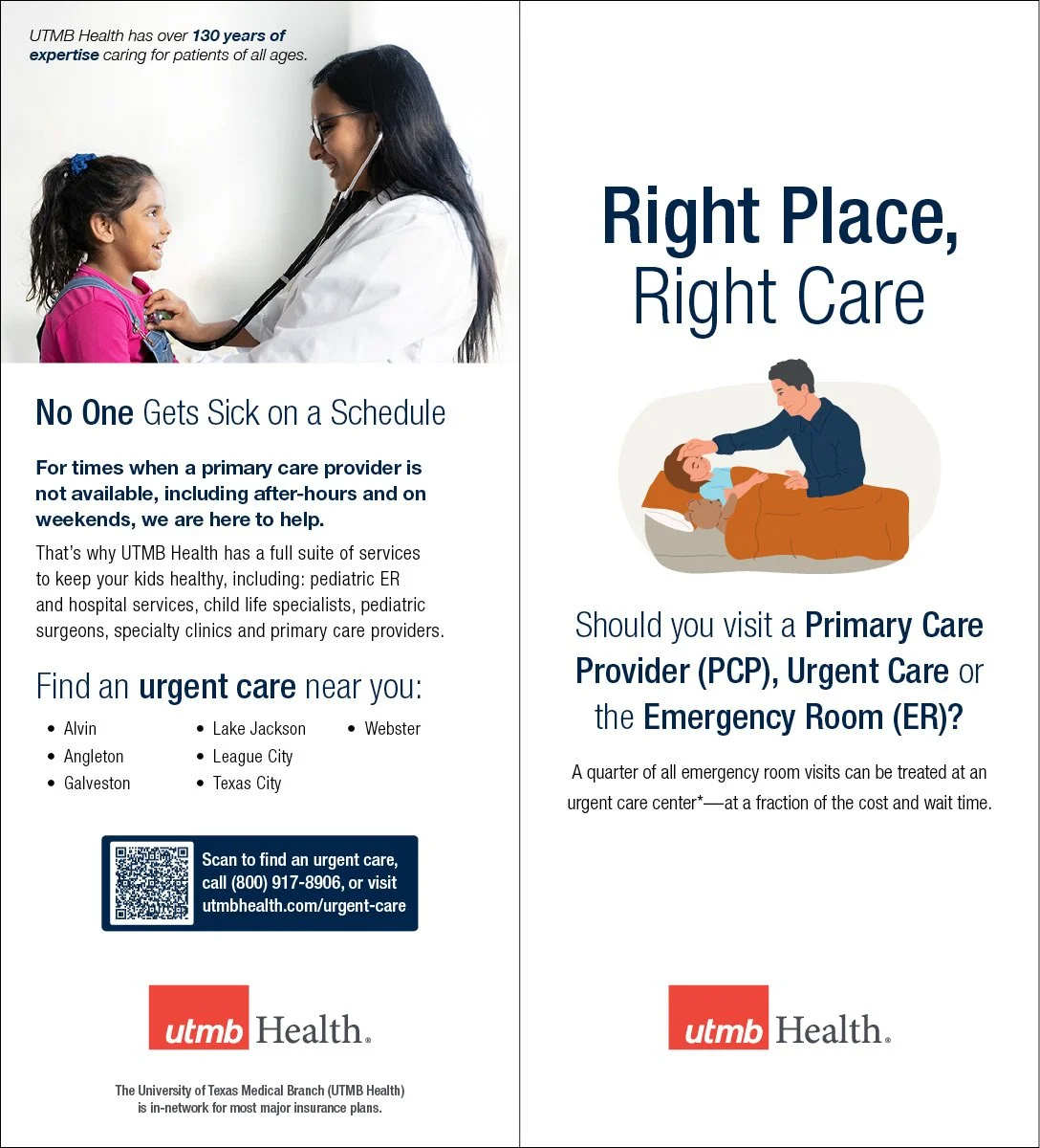
Completed Template - Right Place, Right Care
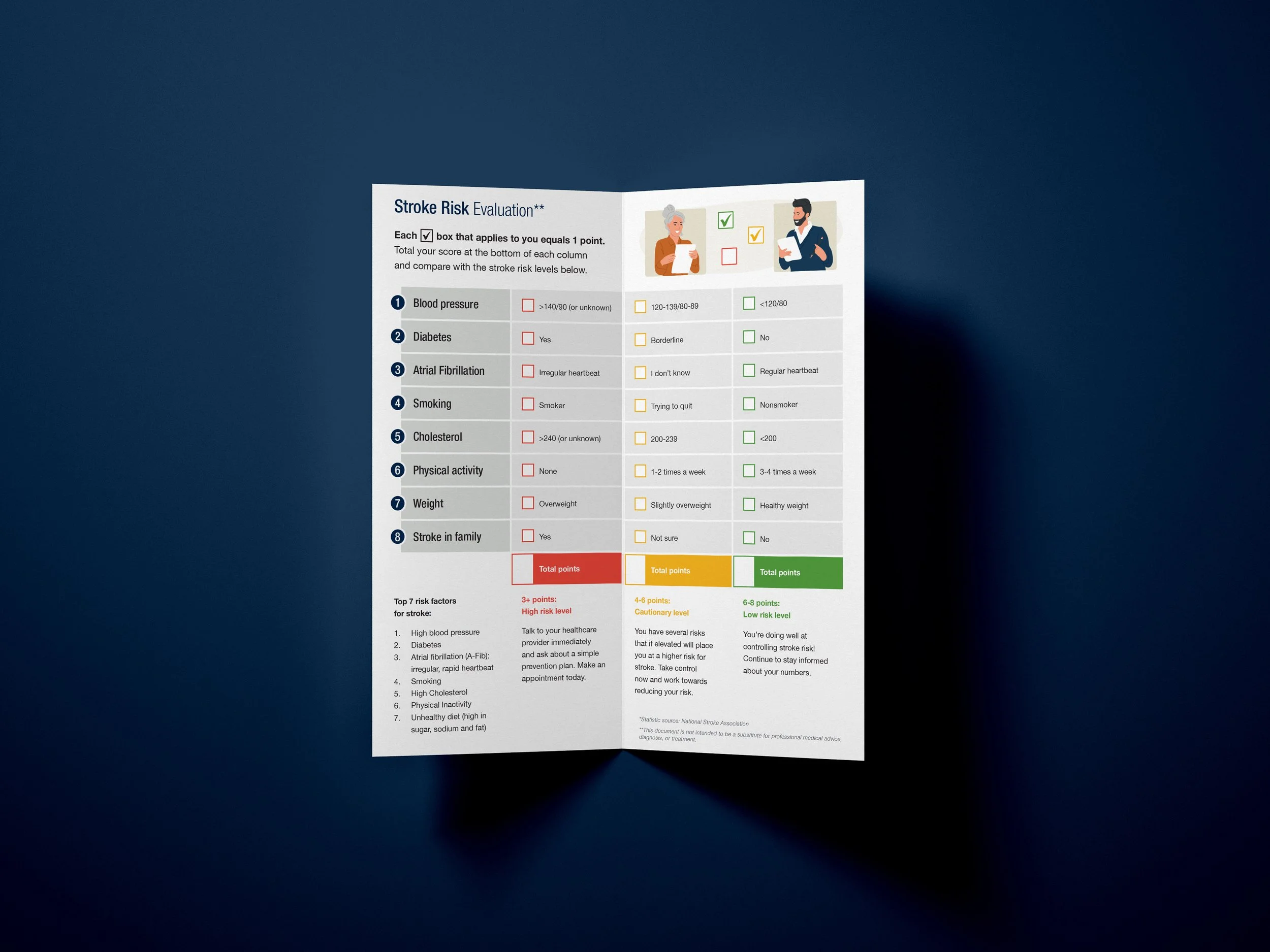
Completed Template - Stroke Risk Evaluation

Illustration
As a way to differentiate UTMB Health’s educational
bi-folds from clinical print collateral, I developed and incorporated a playful illustration style into the template. The illustrations feature UTMB Health’s updated color palette, a variety of lifestyle and clinical depictions, and serve as an anchor for the cover of each piece.


Interior Infographics
To maintain uniformity in one of the least consistent areas of the piece, the interior, I developed a system for color, spacing, and typography for infographics. The infographics are relatively neutral compared to the rest of the imagery and uses color to create emphasis on points of information.

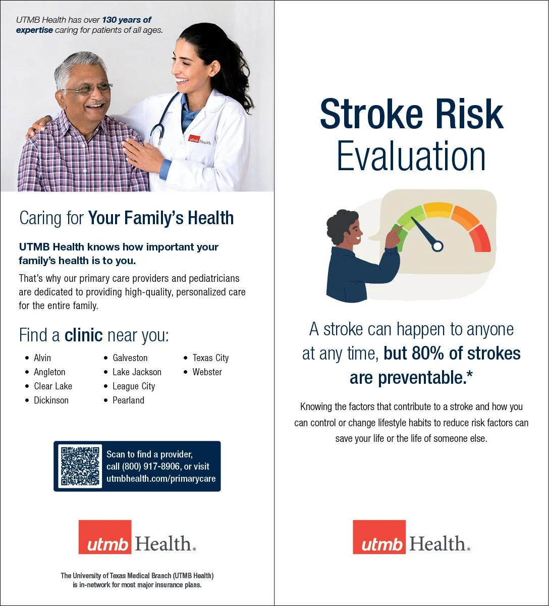
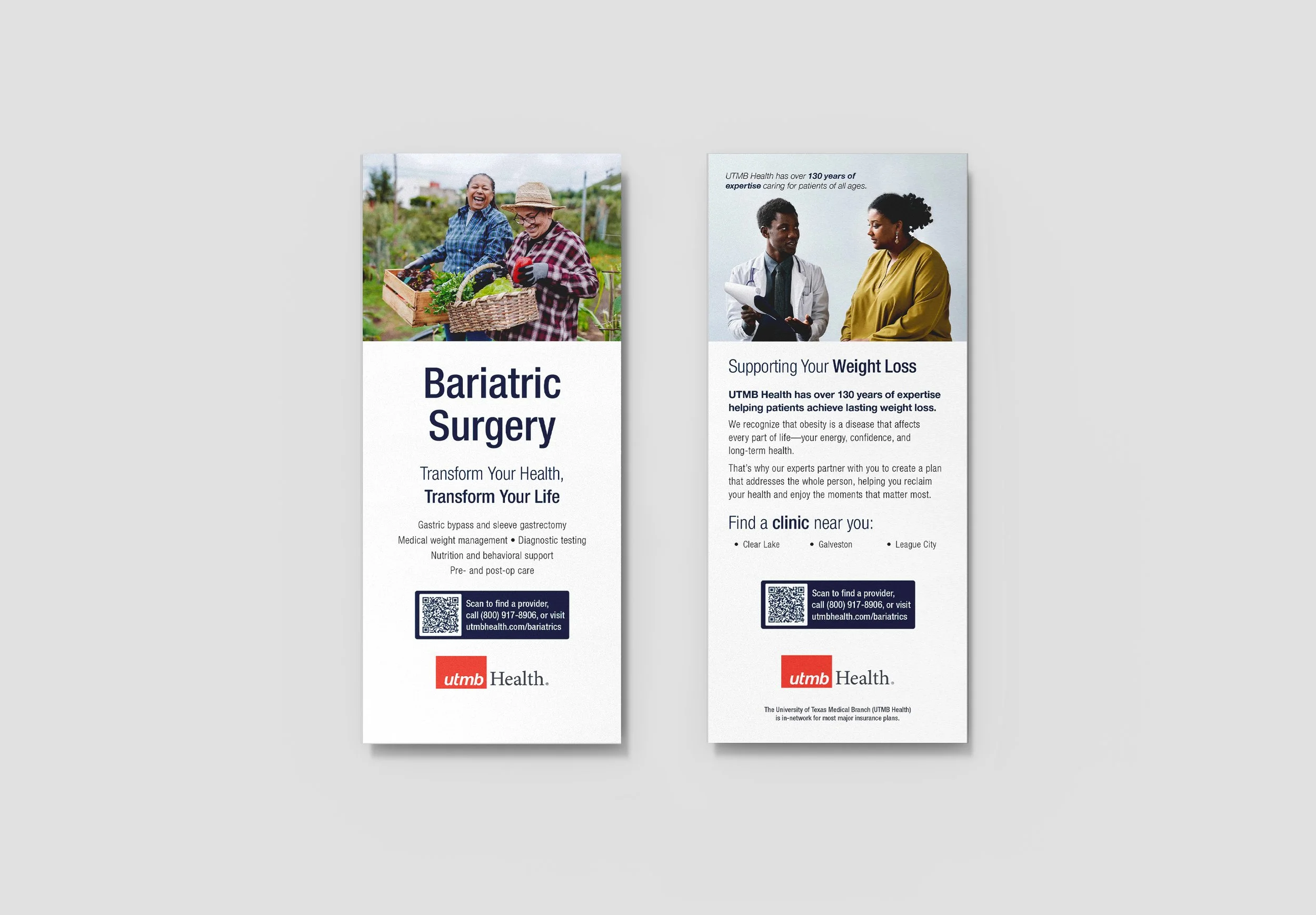
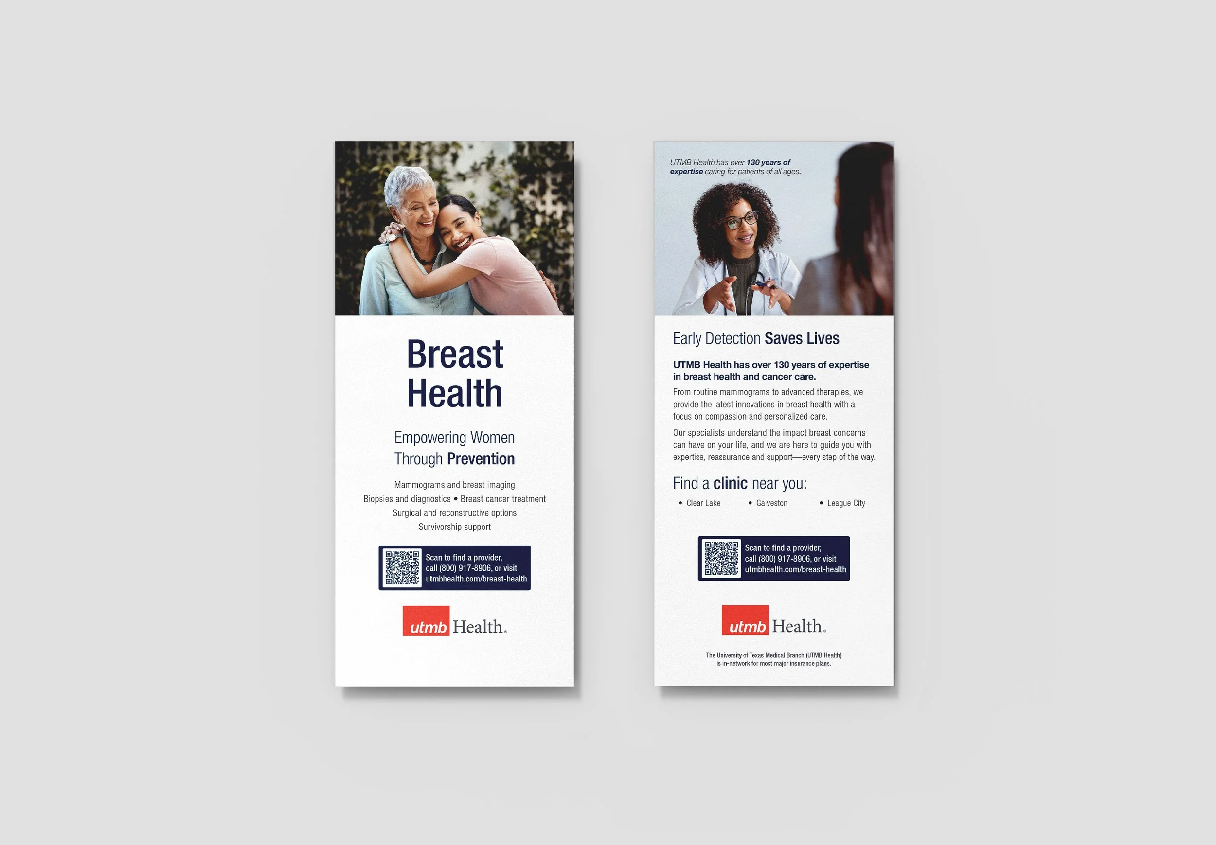
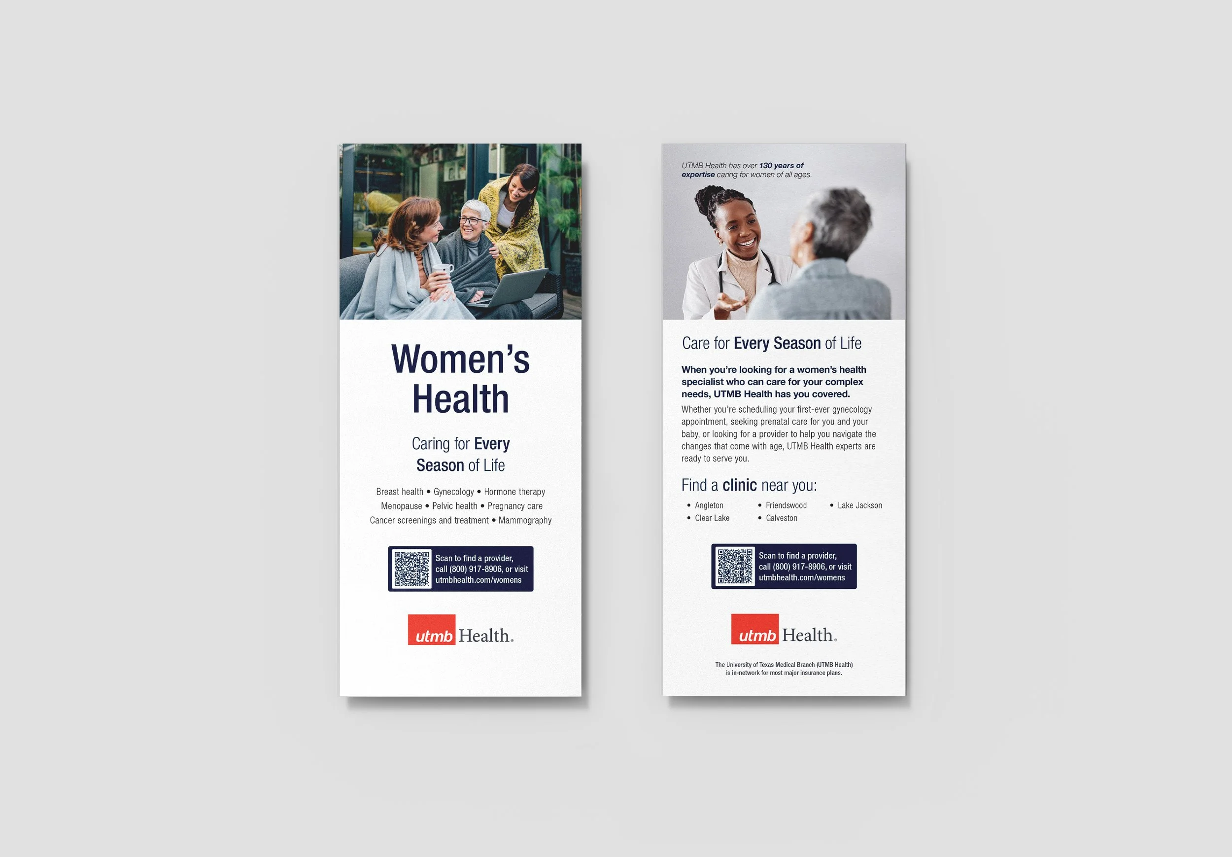
Service Line Rack Cards
Service line rack cards are used to promote a service line, their comprehensive services, and the clinic locations where the services are available. The service line rack card branches off of the educational bifold template, and employs both lifestyle and provider/patient imagery.
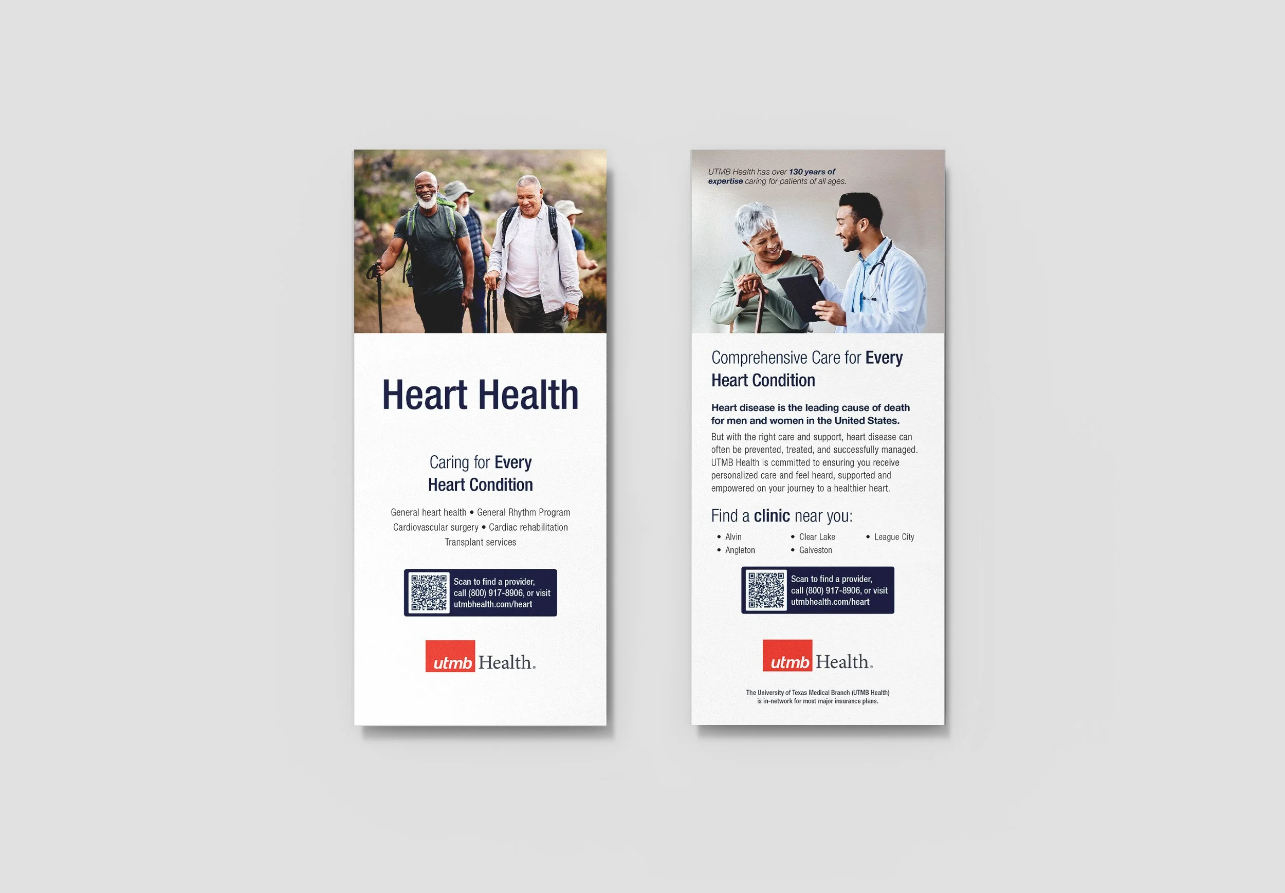
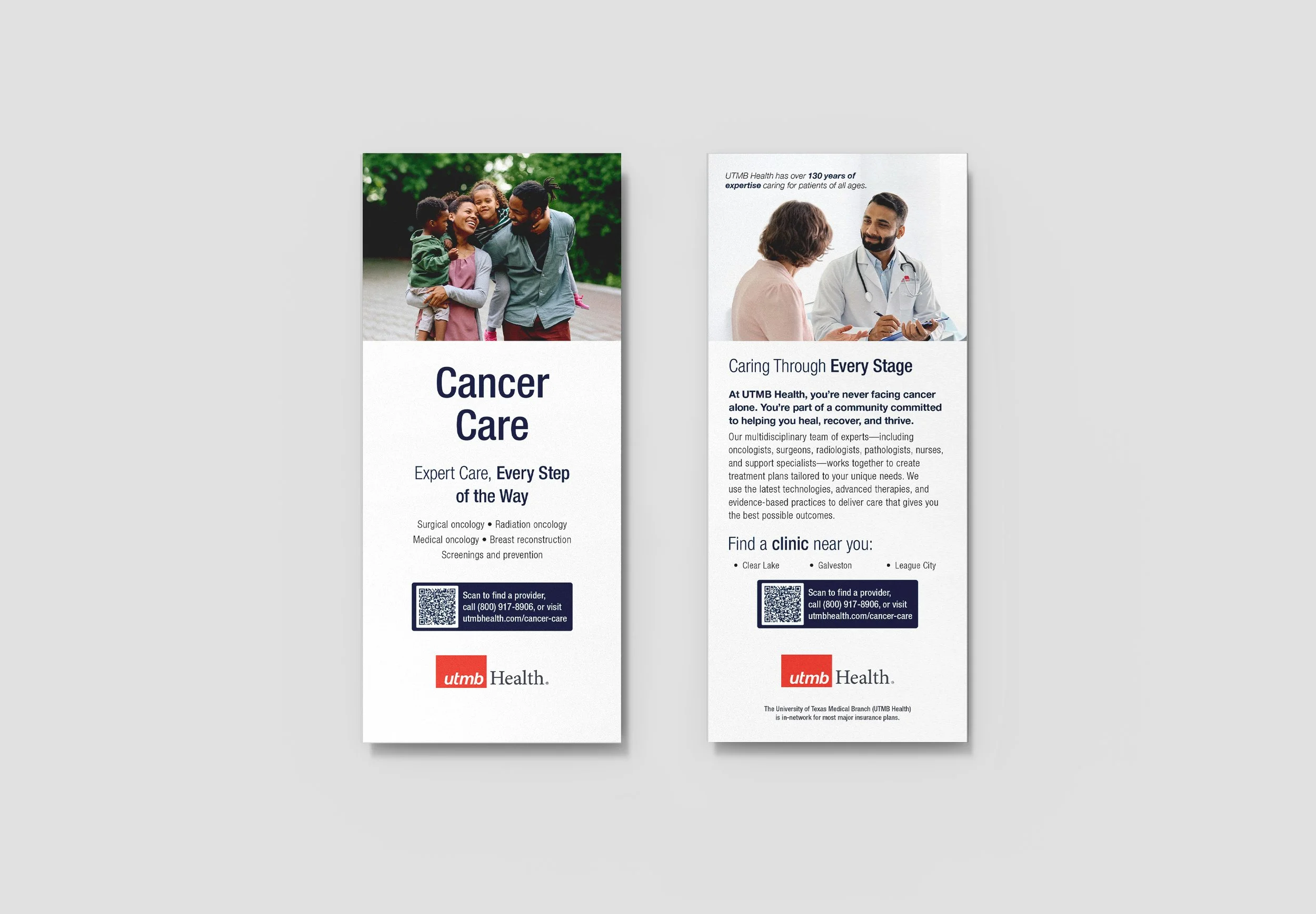
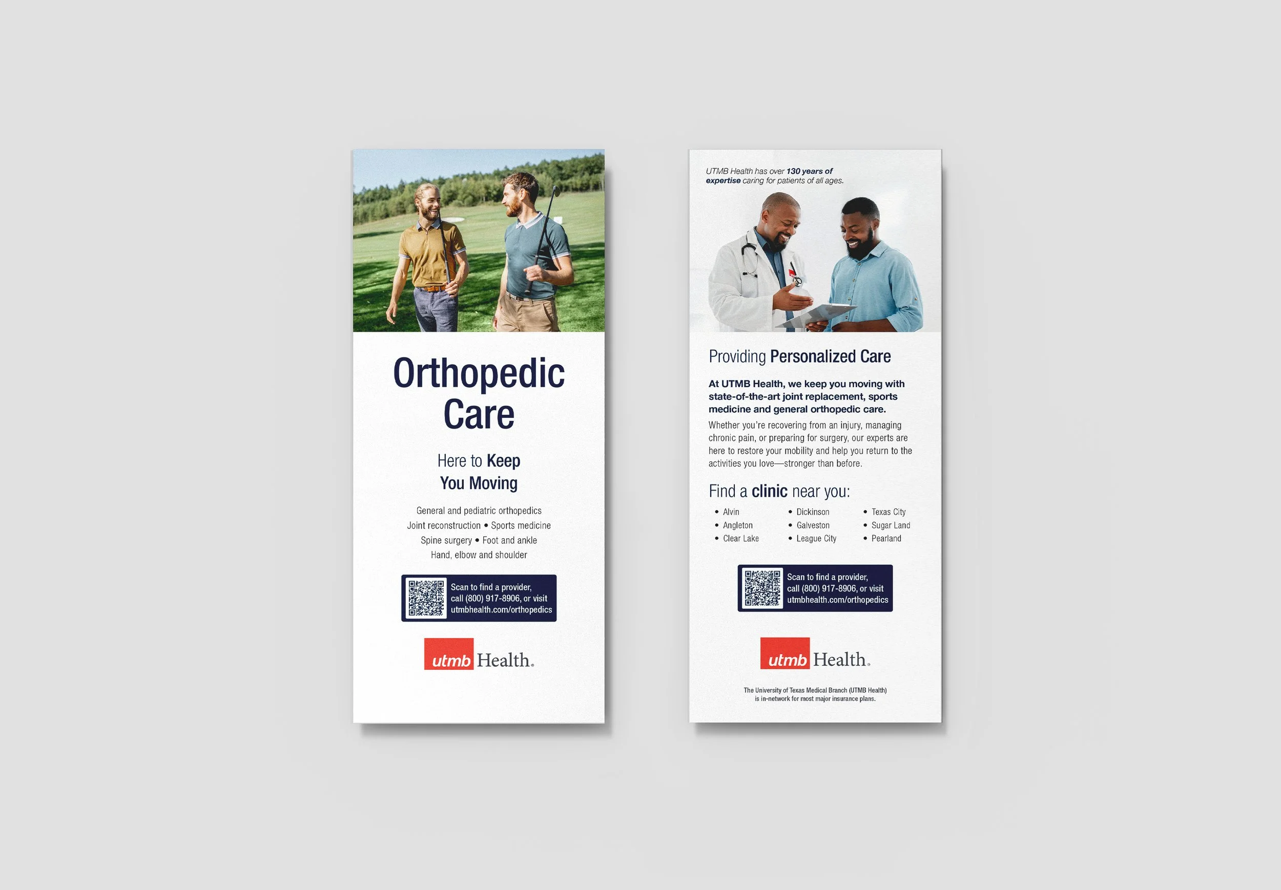
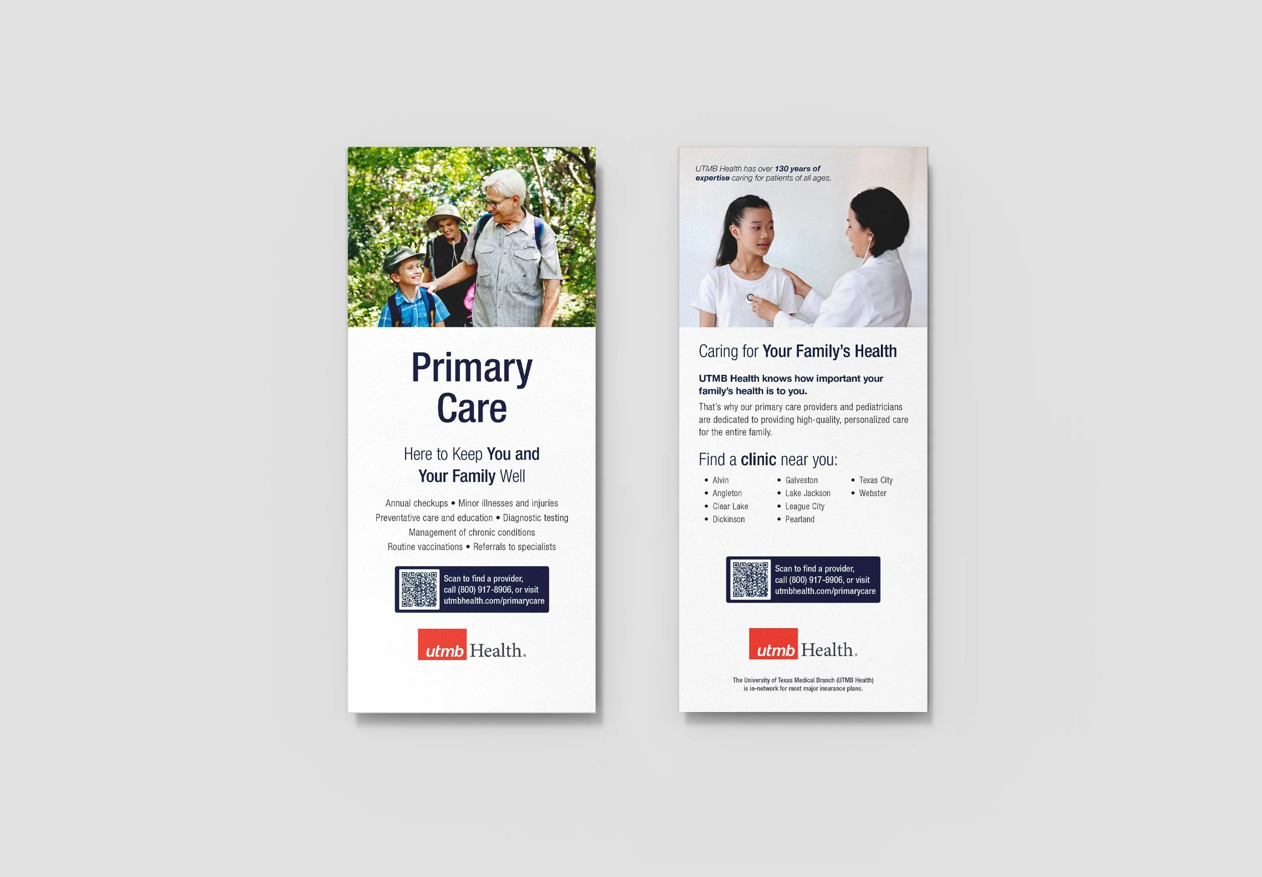
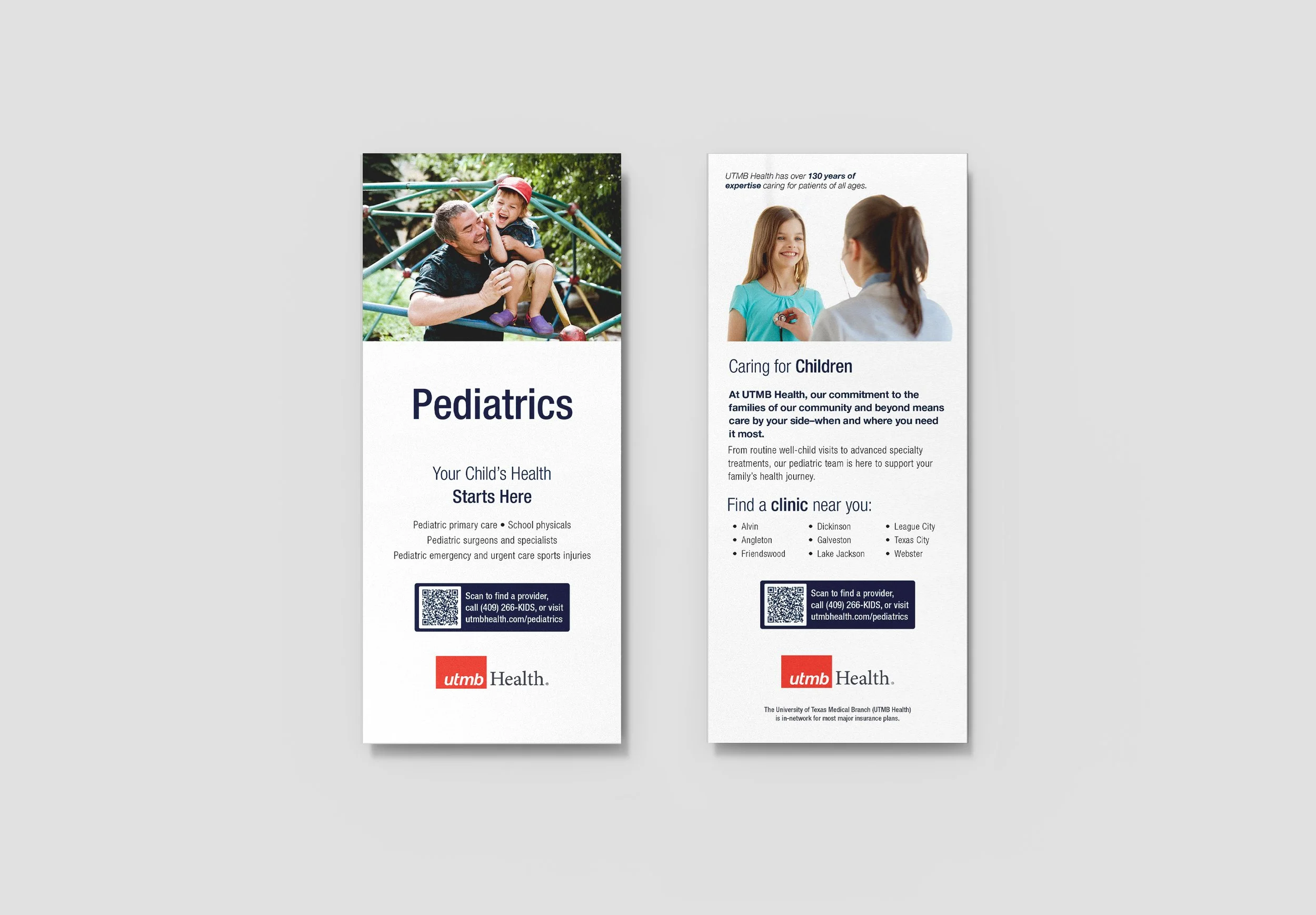
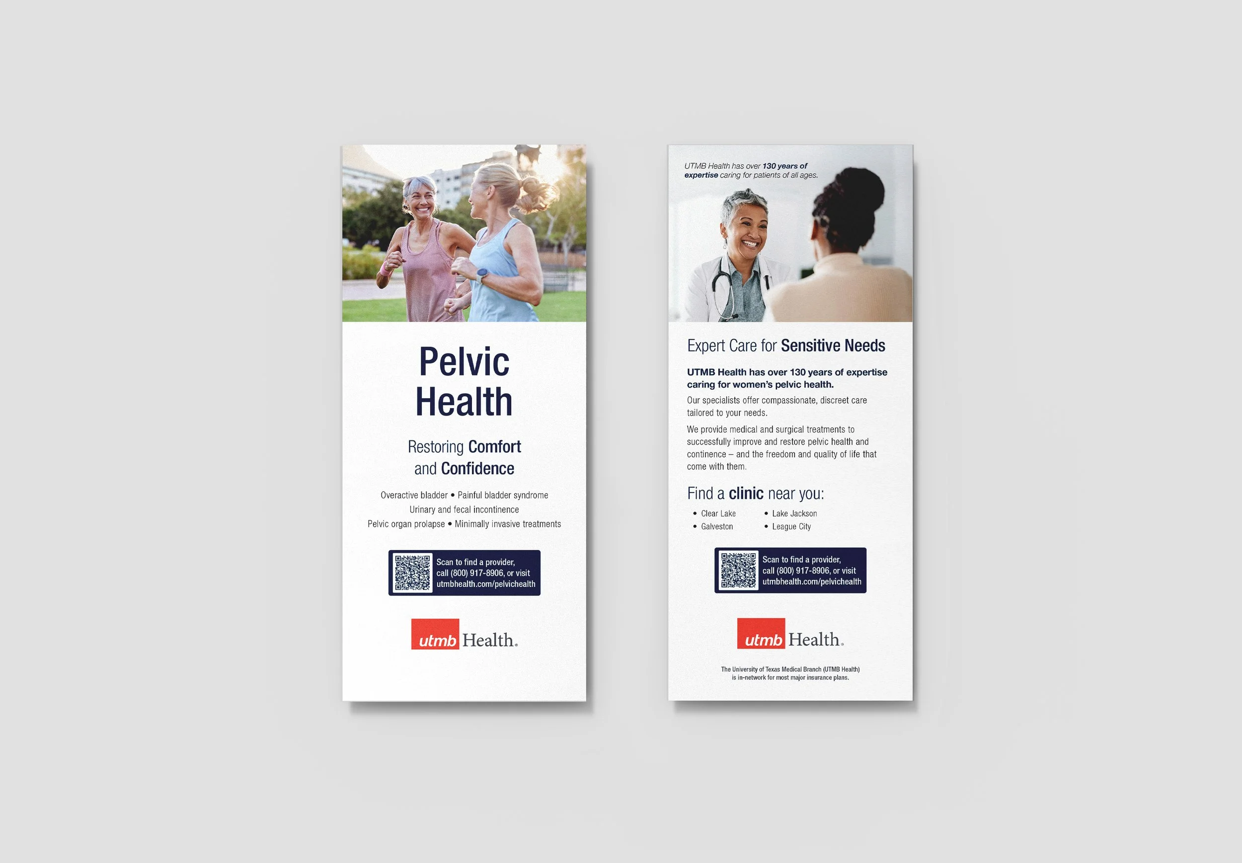
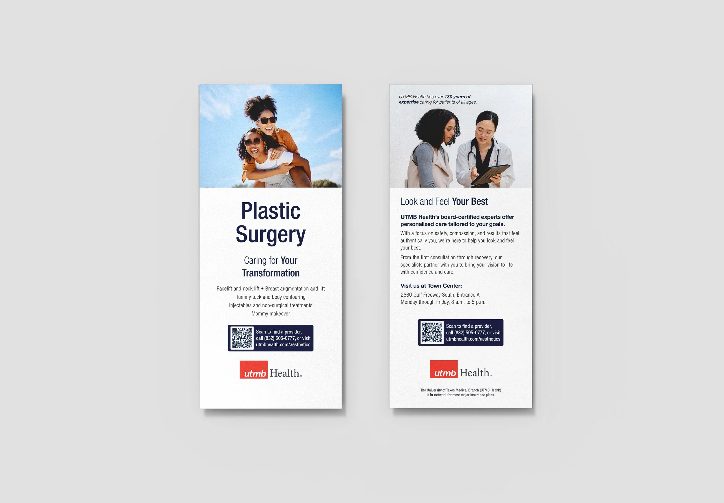


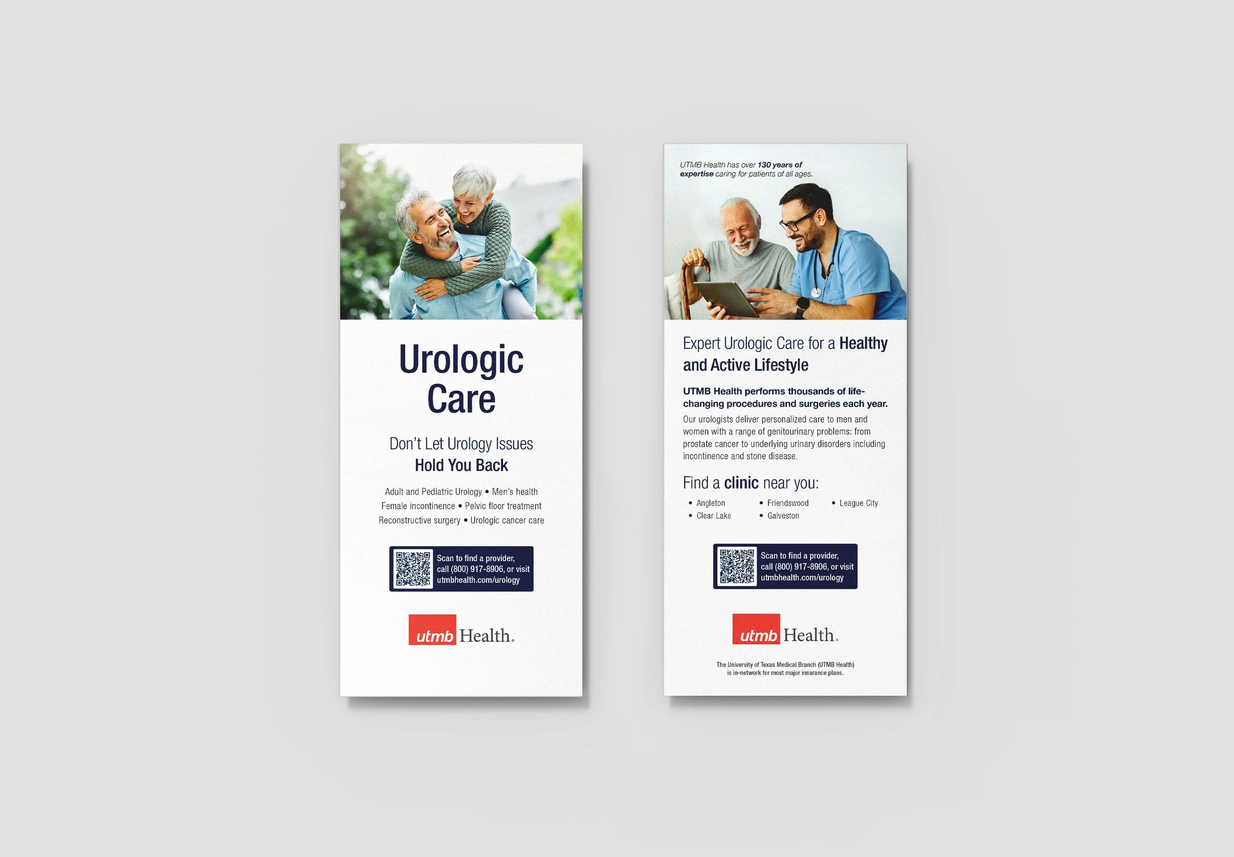
Imagery
Images serve as an anchor point and eye candy at the top of the service line rack cards. I selected images carefully based on coloration, facial expressions, and environment. The images convey a bright, friendly, and warm tone. The images target specific demographics for each service line, but cover a wide variety of demographics when put together as a collective. When placed together, the images provide a consistent visual rhythm across all of the print pieces.


Repetition
Through repetition and consistency, the service line rack cards work as a collective of print pieces. Rigid guidelines allow for new rack cards to be created with ease.
The Bigger Picture
Overall, these pieces function as a portion of a larger system. The educational rack cards and educational bifolds served as the start of a transition to a design system for our print collateral and our overall brand identity.
Following these initial pieces, I went on to create pieces for the clinical environment for internal and external service line referrals, using the initial rack card template and expanding out to one-pagers and index cards. The system developed from these pieces will continue to serve as a baseline for all other print collateral, ensuring quality control and uniformity across our ad campaigns and supportive pieces.